| Disclosure: The links on this page are "Affiliate Links" and while these are shown at no costs to our viewers, they generate commissions for our website(s) |
Five Wall Art Sins You Don’t Realize You’re Making
Wall art is absolutely essential when it comes to creating the type of personalized ambiance you desire for your interior space. When done properly, wall art gives character, establishes mood, expresses originality and gushes sophistication and charm – so don’t mess it up!
Defining a beautiful and appealing interior is a lot of hard work! It takes money, planning, preparation and most of all – patience. So to help you on your journey to become fabulous, here are five common rookie wall art mistakes that can absolutely ruin a space – come on – you’re better than this.

You just “eyeball it”
I know what you’re thinking, “Hey, I have a pretty good eye – I’m just going to put this little nail right here—“. STOP.
The key to creating a well put together atmosphere is in the details. Just because it looks effortlessly executed does not mean that it was in fact – effortlessly executed. So I’m going to give you a little secret that is pretty much common knowledge to art world professionals but tends to be massively elusive to the every day art lover. Behold -- the golden rule:
57” on center
That’s right. Your art should ideally measure 57” in height from the center of the piece to the floor. This is the gallery standard for hanging wall art in a way that is aesthetically pleasing and naturally comfortable for the viewer.
Hanging art too high causes strain and hanging too low feels awkward. It is important to envision your wall art as a world of sorts – you want the viewer to feel enveloped in it and surrounded. For paintings of a larger scale - let’s say, 40”+, it is not uncommon for professionals to hang them a smidge higher (think 59”-60”), however 57” is the standard tried and true.
You’re not looking at the big picture
When hanging several pieces in one space, it is imperative to envision them as a uniform whole. The number method to ensuring your work is going to look absolutely fabulous together on the wall? Floor arrangement. Arrange pieces in an aesthetically pleasing way via the floor before you start drilling holes. This saves endless time and energy.
Too much space in between wall art, too little space in between frames, varying heights with no uniform center point – these are things which can throw an entire room off. Whether your piece is 48”x48” or 8”x10”, make sure your center points are consistent. This also will help to take away some of the legwork with regards to their arrangement in relation to one another.
Keep about 2”-3” of space in between each one and try to keep the color palette uniform with any potential outliers in terms of color/tonality focused towards the center. As a general rule of thumb, “heavier” paintings tend to go either towards the center or on the left in relation to others. This rule of thumb can also apply to images of a “heavier” tone.
It is also imperative to take into consideration the layout of the space prior to hanging. If a particular side of the interior feels less open due to furniture and other home accents, place art pieces on an emptier side in order to create equilibrium.
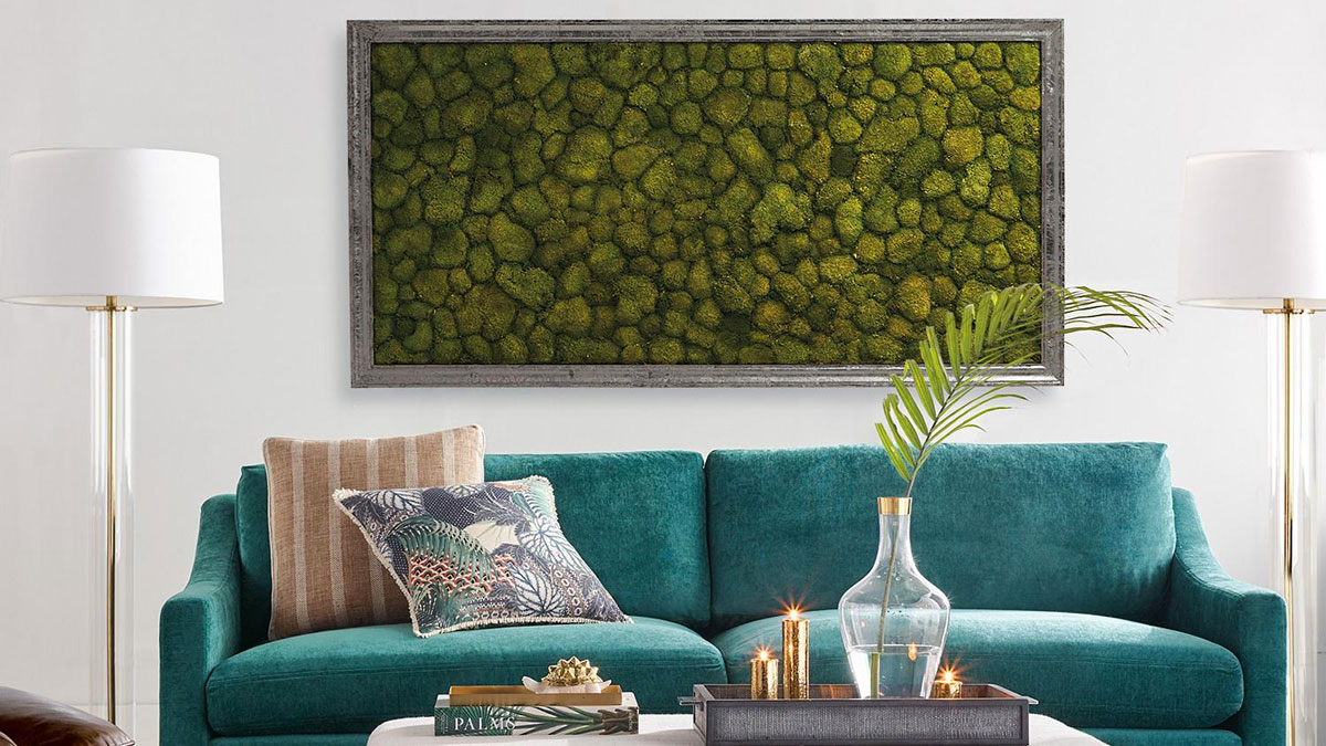
If hanging over a sofa, the common mistake is to hang pieces too high. There shouldn’t be any more than 6”-8” of space in between the bottom of your painting and a piece of furniture that it is hanging over. Also, the general rule of thumb is that an art piece should ideally be approximately 2/3 the length of your sofa if being hung directly over.
There’s more harmony in the Middle East than there is on your wall
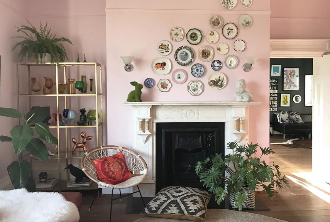
When it comes to interior design and home décor – the key word is harmony. Harmony in everything -- with any crazy accent pieces being balanced out. Harmony has several dimensions and contexts within the case of interior design. You want color harmony – paintings with a similar color palette; grouping harmony by ensuring pieces are evenly spaced and the overall shape is aesthetically pleasing and well-balanced; and lastly you want to ensure that the images fit well within not only the context of the interior as a whole but within the context of their specific defined space (i.e. wall).
Get it like Goldilocks
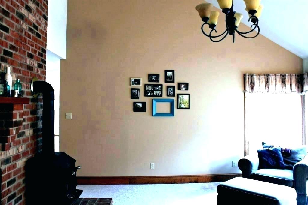
Ever walk into a space and see a gigantic wall with one small, little lonely painting in the center or even worse – off-center ? Sights as such will throw my OCD out of whack quicker than touching a dirty city park hand rail. What about a big feature piece on a small accent wall? Ugh! Awful! It just looks clunky, over-sized and out of place. It is so unbelievably important to always remember to balance, balance, balance. Also – as much as over-sized pieces on small surface areas can often look chunky and out-of-place, the general rule of thumb is that if you have to opt for too small or too big – bigger is always better.

Your frame game is off
Keep it simple, especially with contemporary wall art. Typically less is more when it comes to the frame as you want your art to be the highlight and center of attention. Chunky, gawdy frames with ornate detail and varying designs are typically reserved for Renaissance-era, Baroque or more traditional and classic pieces (think Michaelangelo, Monet, Gaugin and Tissot). Otherwise – overelaborate frames tend to just look gawdy and take the attention away from a piece’s beauty.
When it comes to color, black or white go for miles. You can’t go wrong with neutrals. However, in the event you’re feeling a bit daring and want to spice it up a bit for a neutral or washed interior, choosing frames in the same color palette or of complementary colors for multiple pieces can really give your art that extra umph! After all – it is a statement you’re making – so if you’re going to do it you might as well go for the gold.
Bear in mind the other option as well – if the work is an installation piece or a painting or photograph - foregoing a frame altogether may very well be the best option, especially if it is finished on a premium gallery-wrap canvas with thick sides. These usually look best sans frame or in floating frames.
By D. Holland Ingram


